Windows
Contents
The windows can be inserted to the GUI by dragging from the buttons and dropping them to the GUI.
See the User Interface / Customizing the User Interface chapter in the manual to learn more about GUI editing.
Color Square

Color Square gadget for creating predefined colors.
The Color Square gadget is a rectangle that shows a constant color.
You can drag&drop the color from a Color Square gadget to a View window to set the color of the currently selected objects.
The color can also be drag&dropped to any color gadget in e.g. property gadgets or tool gadgets.
The color of the Color Square gadget can be set by double-clicking the gadget and
specifying the color using the color dialog that opens.
Color

Color gadget
The color gadget allows to define a color numerically.
You can drag&drop the color from the color canvas of a Color gadget to a View window to set the color of the currently selected objects.
The color can also be drag&dropped to any color gadget in e.g. property gadgets or tool gadgets.
Client

Client window
Client windows are floating windows that can be docked to container windows.
The client window has the following options:
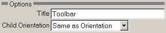
Title - Title for the window.
Child Orientation - Select whether and how the children's orientation follow the Client window's orientation.
Container Window
Container window
Container window is where Client windows can be docked.
The container window has the following options:
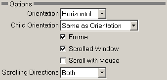
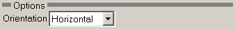
Orientation - Orientation of the container window.
Scrolled Window - Check to make a window whose contents can be scrolled if they do not fit inside the window.
Scroll with Mouse - Check this if you want to scroll with the mouse.
Scrolling Directions - Select in which directions the window will scroll.
Separator

Separator gadget
Use this gadget to separate other windows.
The separator gadget has the following options:
Orientation - Orientation of the separator gadget.
Cycle

Cycle gadget
The cycle gadget has a drop down list gadget where different 'pages' can be selected.
Other gadgets can be drag&dropped to the pages. Only one page at a time is visible.
The cycle gadget has the following options:

Orientation - Orientation of the cycle gadget.
Add - Add another label.
Delete - Delete the selected label. Select the label in the Labels gadget.
Label text - Change the selected label. Select the label in the Labels gadget.
Tab

Tab gadget
The tab gadget has one or more labeled tabs. Selecting a tab opens a different page.
Other gadgets can be drag&dropped to the tab pages. Only one page at a time is visible.
The tab gadget has the following options:

Labels - Shows the labels that are to be created in the tab control.
Add - Add another label.
Delete - Delete the selected label. Select the label in the Labels gadget.
Label text - Change the selected label. Select the label in the Labels gadget.
Frame

Frame gadget
Creates a frame with text.
Other gadgets can be drag&dropped inside the frame.
The frame gadget has the following options:
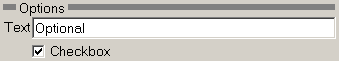
Text - Text label on the frame.
Checkbox - Check this if you want to create a frame that can be closed.
Splitter

Splitter gadget
Splitter is a gadget that divides its parent window either vertically or horizontally.
The splitter can be dragged and moved with the mouse.
Other gadgets can be drag&dropped to both sides of the splitter gadget.
The splitter gadget has the following options:

Orientation - Orientation of the splitter gadget.
Window

Drop target window
The drop target window has the following options:
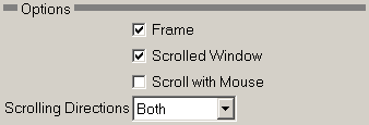
Frame - Check to create a thin frame around the drop target window.
Scrolled Window - Check to make a window whose contents can be scrolled if they do not fit inside the window.
Scroll with Mouse - Check this if you want to scroll with the mouse.
Scrolling Directions - Select in which directions the window will scroll.
Load

Load GUI object
Load a saved GUI object as part of the GUI.
The Load tool has the following options:
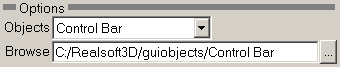
Objects - Select a GUI object to load.
Browse - Browse for a file containing a saved GUI object.
Float

Floating window
Open a floating window.
The Float tool has the following options:
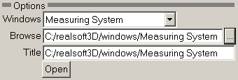
Windows - Select a predefined window or create a new one.
Browse - Browse for a file containing a saved floating window.
Title - Title for the floating window.
Open - Click here to open the floating window.